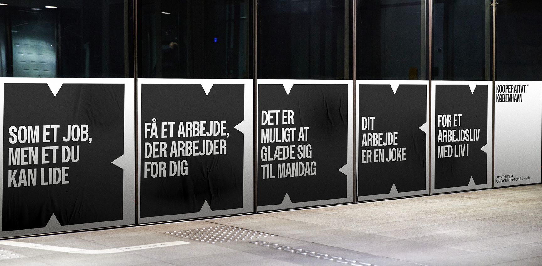
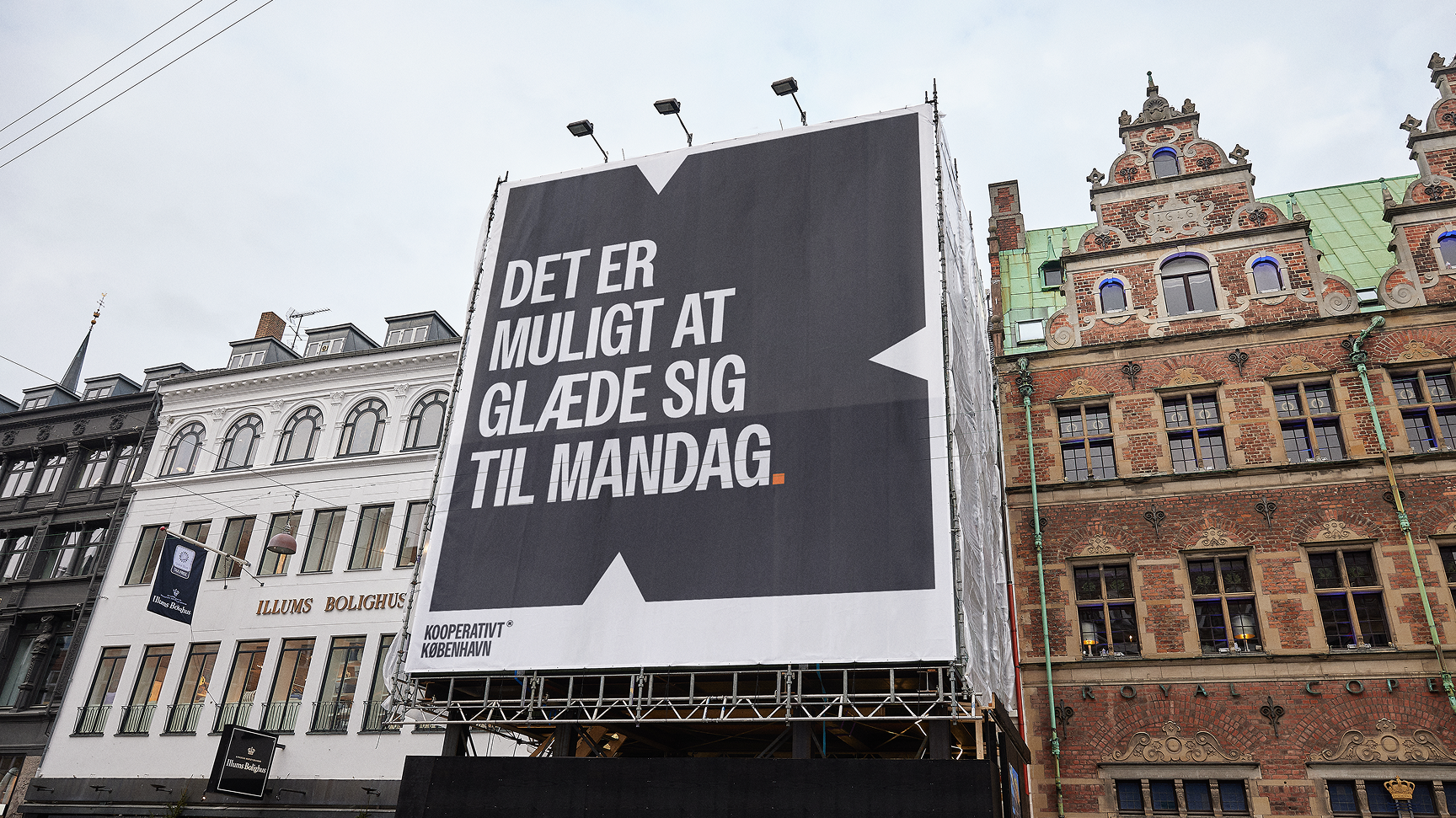
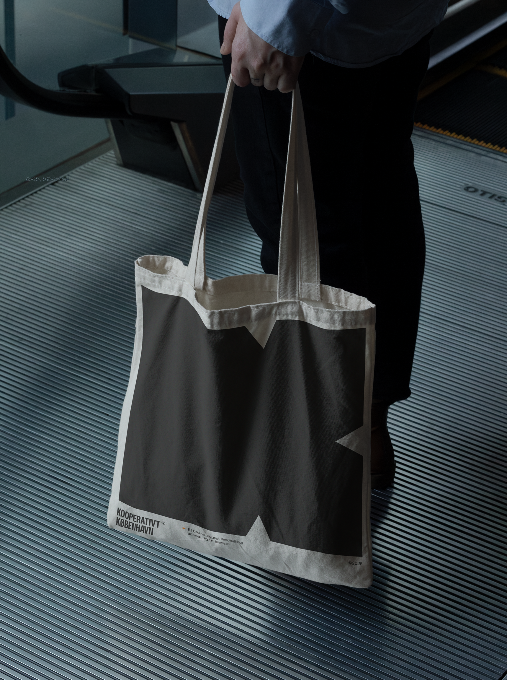
Dynamic visual identity for Kooperativt København – a community for a sustainable, diverse, and fair business environment. Bombastic and simple – because Kooperativt København wants to speak loud and clear from both podiums and beer crates.
The logo consists of two large abstract K’s, symbolizing both “Kooperativt” and “København.” The logo has a strong impact, signaling clarity and confidence. The inward-pointing arrows in the “K” emphasize an activist message and highlight that Kooperativt København seeks change. It is modern, streamlined, and stands out from the traditional image of the cooperative world.
Client
Kooperativt København
Year
2025
Services
- Conceptual design
- Logo design
- Merch
- Motion design
- Visual identity
Notes
- Made in collaboration with design agency: Public Service.